

Creating a more Customized Onboarding Experience
How might we become the #1 alternative browser set as default or added to the dock? After years of losing market share to other browsers, a tech company wanted to know how they can increase revenue and user retention in their mobile browser.
*Client and work have been sanitized for confidentiality purposes
On this project my role was the lead designer and mentor to an associate product designer. I also developed and managed the design process workplan based on the objectives of the project and the terms of the SOW.
The workplan I developed included:
- Secondary research plan
- Primary research plan
- Workshop plan
- Design/ prototyping plan
- Testing plan
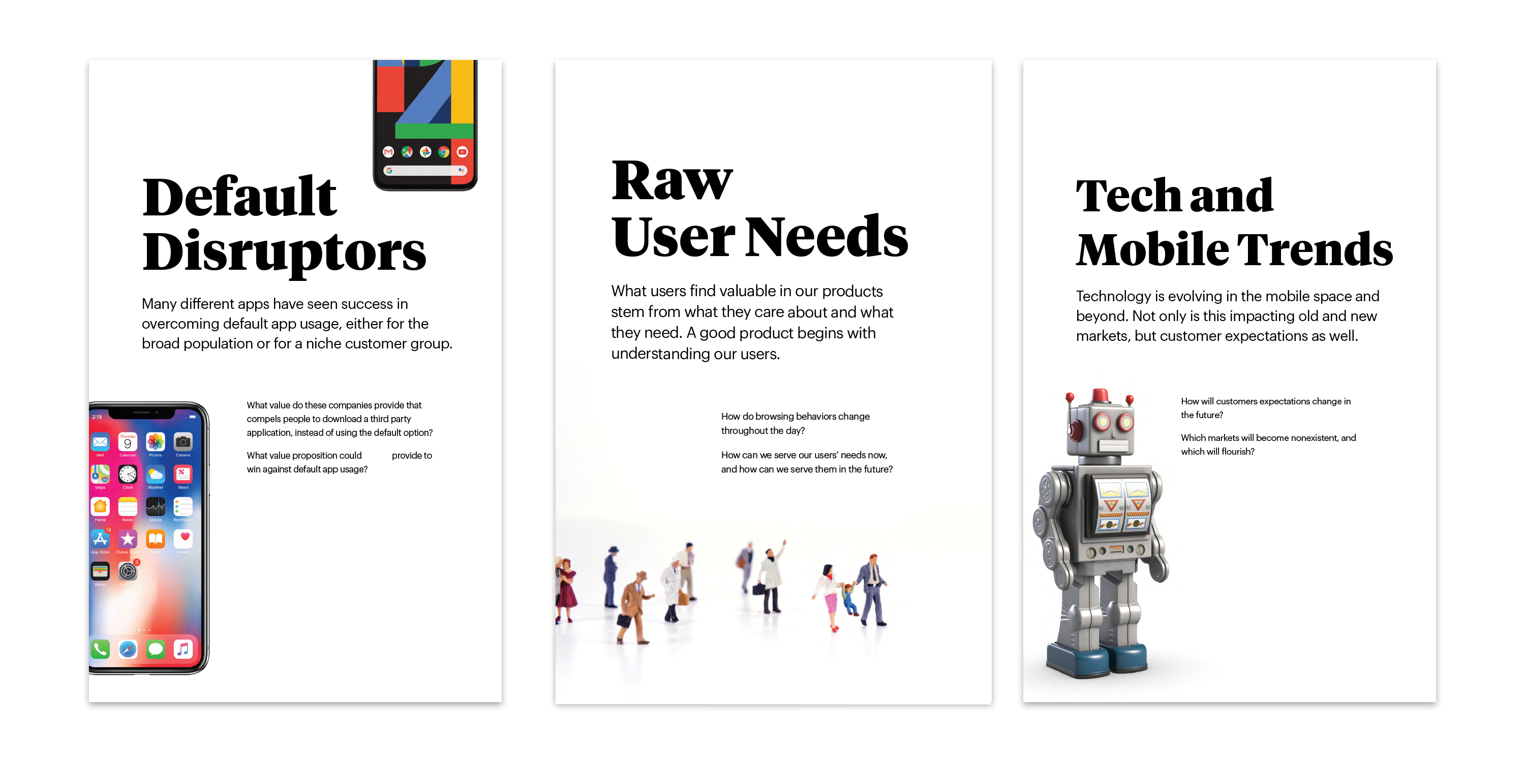
Personas vs Archetypes
“We design for everyone"
Internally this large company had the problem that a lot of companies with a large user base have, the inability to identify who their users are. There was a fear amongst the product team of segmenting their customers and 'leaving out’ some of their customer base. However, without a strong definition of their customer, many features and products tended to be very engineering-led, rather than user-centric.
After running 14 interviews we synthesized into needs using quotes from the interviews and used these archetypes to focus the ideation workshop around user needs.

The Ideation Workshop
After Phase 1 of the project, where we framed the problem and conducted discovery research, I planned the agenda for the ideation workshop, which would feed into Phase 2 of the project— devleoping a concept and testing our solution. The workshop was one day and included 30 people in the organization— a chance for the leadership team, engineers, marketing, UX Research, and design to all align around a common goal.
I designed exercises around empathizing for the user needs of today and tomorrow and inspiring through technology trends around mobile. I led the design and creation of all the materials used to inspire the workshop participants.
** I was even asked by a few people in the organization if they could keep some of the materials to use in other workshops

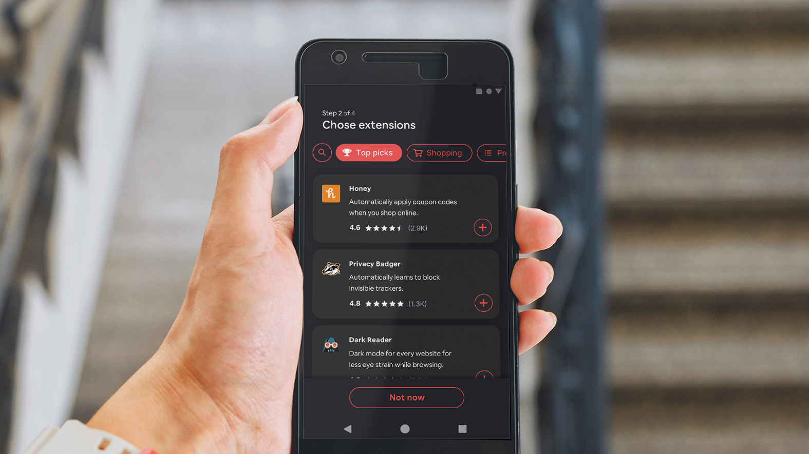
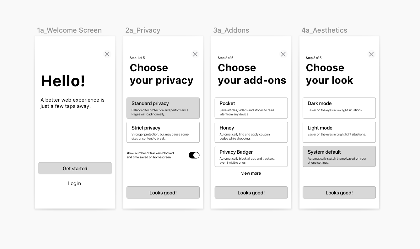
Creating a better onboarding experience
A 'tailored onboarding experience' was chosen as the concept that the client wanted us to go after, as they felt it would be an easy idea to test and low-hanging fruit to help with user retention.
With five weeks left of the project, I revisited the SOW and workplan to make sure we would deliver a tested concept with enough user feedback and alignment with the team.
We created low fidelity mockups and tested with 6 participants using Respondent.io. Typically, I prefer to user test in person, but with the short timeframe of less than one week and the variance desired in user types a moderated video call was the best option. I wrote the user testing script, while leading the design of the low fidelity mockups and in two days we were ready to test with our participants.
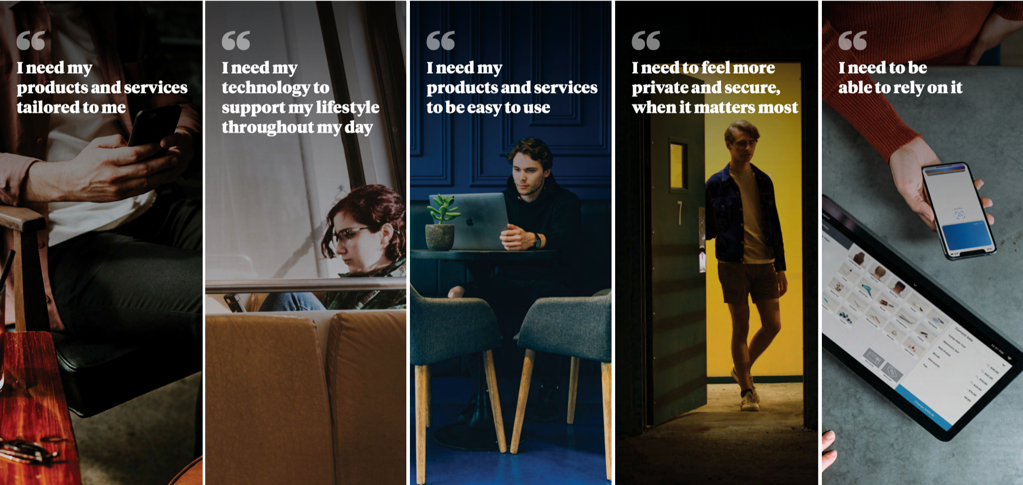
Each table was given one of the user needs to ideate around. The table I faciliated was given "I need to feel more private and secure, when it matters most". We then creating an empathy map of our user as a table, a journey of the user in 3 years in pairs, and developed How Might We questions to solve our user need as a table. After using Dotmocracy to decide on the best HMWs to solution we ideated around it and prioritized our ideas by feasibility and user value. Each table developed one idea that most solved the prompt of becoming the #1 alternative browser that users put on their dock or set as default.
After the workshop we prioritized all ideas across tables based on feasibilty and user value (we adjusted this based on business value where applicable). I brought in a manager of Engineering from my team to help determine feasiblity from the solutions.

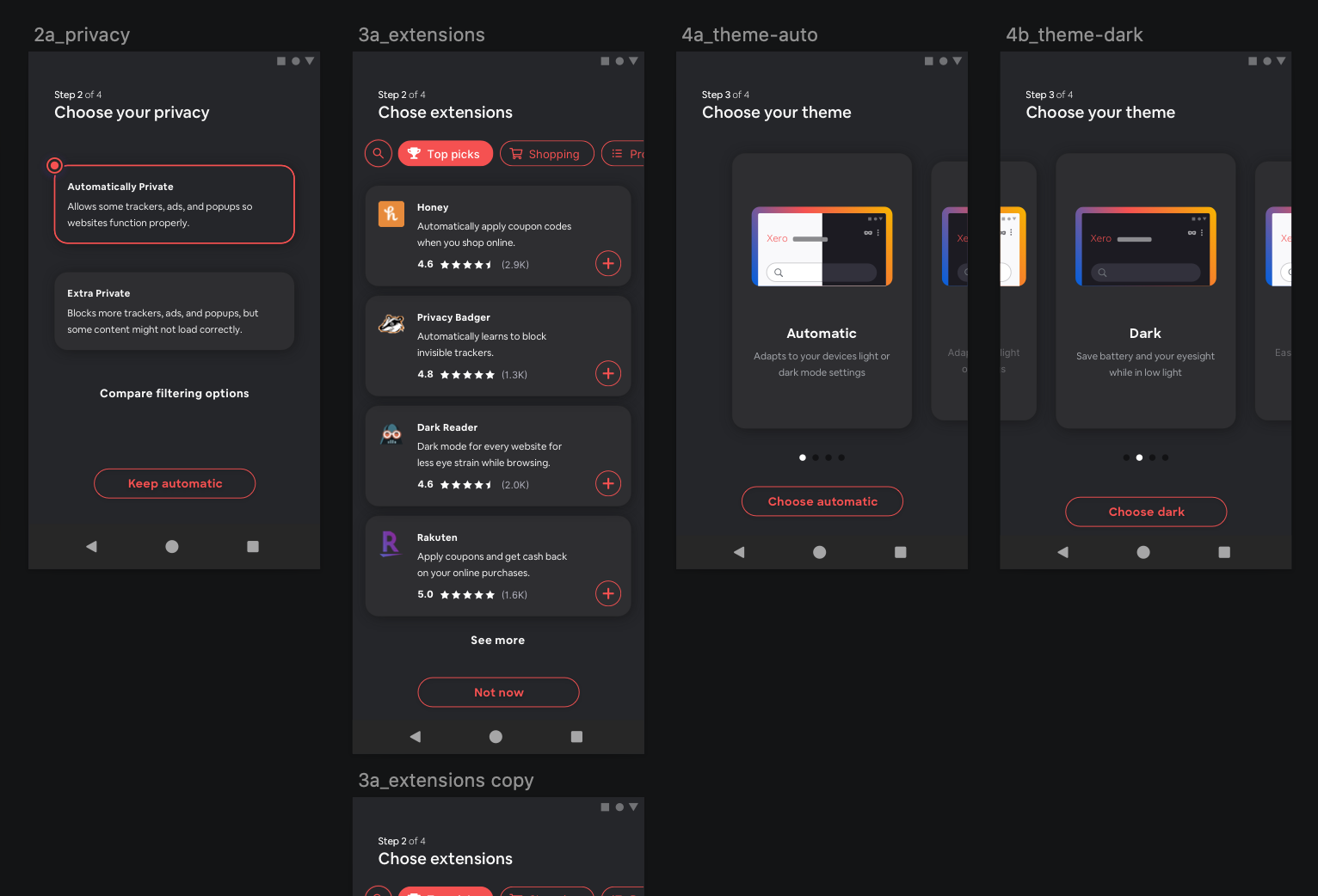
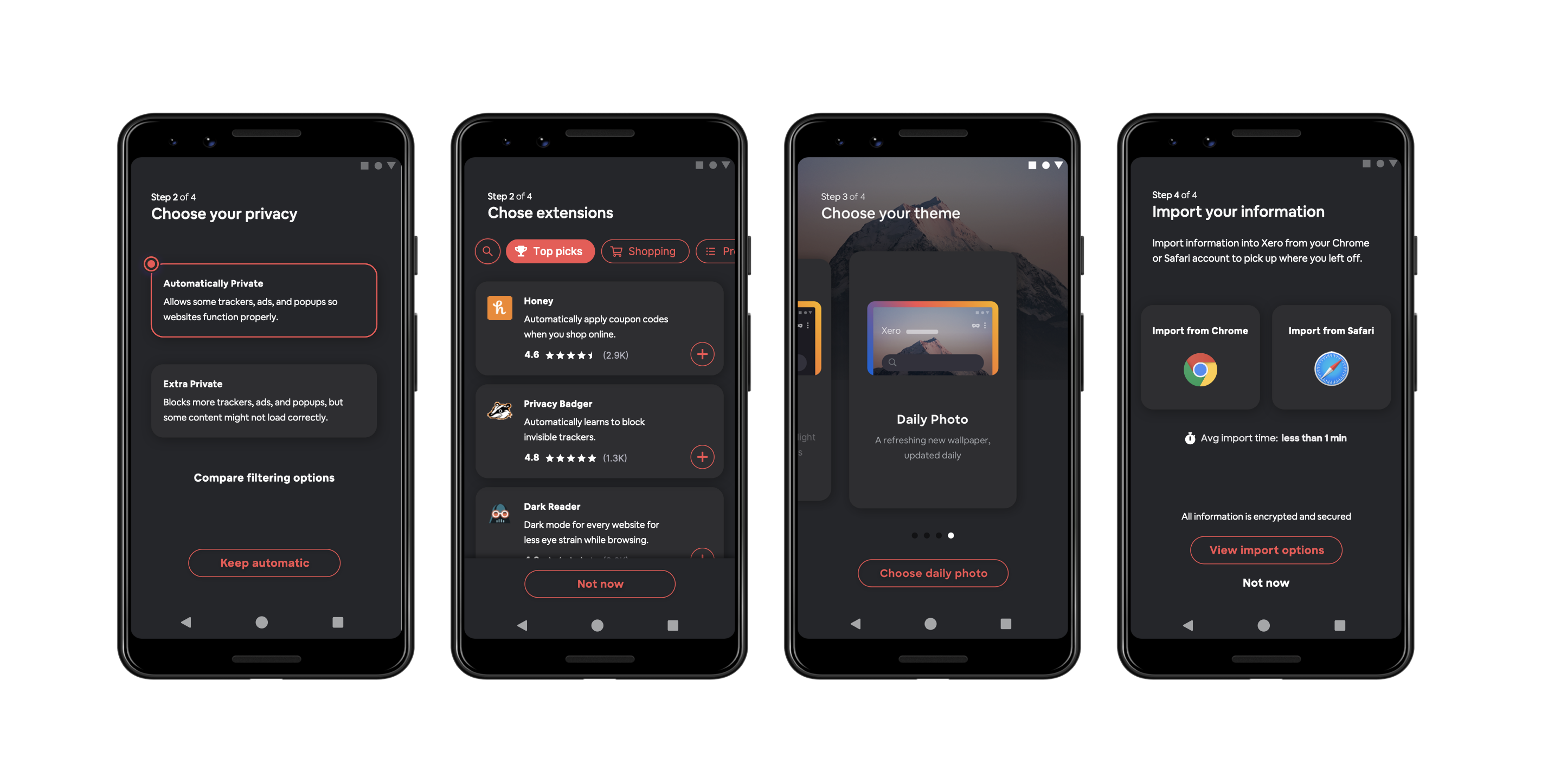
A few of the 20 screens we designed and tested
Participants responded positively to the design and preferred seeing the features of the browser laid out step by step. Even if participants were more convenience-focused than privacy-focused they appreciated the fact that the browser strongly focused on privacy. Based on user feedback we designed another iteration, where we spent more time on visuals, content, and used client's design guidelines.
We tested the next iteration the week after with 5 participants from Respondent.io using moderated one hour video calls.

Iterations
Besides other features we tested other versions of the onboarding experience including in-app onboarding and scroll. While testing the scroll version participants barely read through the onboarding options. The in-app experience tested well, but we wanted to spend more time focusing on a tailored experience, as I felt it more successfully answered the brief.

After testing this iteration we spent a 3 days making adjustments to the design based on the feedback we heard in the last interviews. We then used a tool called Remesh.io, which is a large virtual focus group of about 100 people (not a large n, but higher than with just 11 people) and showed videos with voiceover of both onboarding experiences.
Results
Results of the Remesh.io session showed that the onboarding experience would produce better results to retention.
- 41% were more inclined to create an account with new onboarding vs. 20% for their current onboarding
- 49% felt new onboarding browser is more tailored to them vs. 18% for their current
- 43% felt both onboarding processes protected privacy equally well vs. 40% for new onboarding and 14% for their current
The prototype was well received by the clients and was handed off. The engineering team is currently building the new experience.